前回の記事で Stable Diffusion モデルの TensorRT Engine 化を行ったので、今回は TensorRT 化したモデルをモデル可視化ツールである trt-engine-explorer (TREx) を用いて解析してみます。モデルの解析しボトルネックを見つけることで、さらなる速度の改善やメモリ消費の改善などに繋がります。
TREx の詳細についてはこちらの記事も併せてご確認下さい。
trt-engine-explorer (TREx) のリポジトリから release-8.6 のバージョンのコードを取得し使用します。TREx はこちらの手順に沿ってインストールしてください。
3 つのモデルが TensorRT Engine 化されているので、 その中から U-Net モデルを確認してみます。
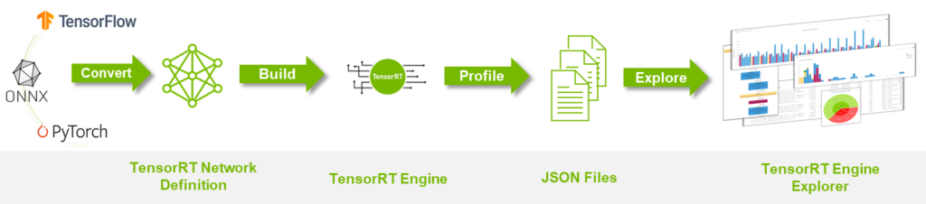
解析は下記のプロセスで行います。現狀は TensorRT Engine の作成まで完了しているので、 Profile 処理をし JSON ファイルを作成し、それを TensorRT Engine Explorer(TREx) に渡す必要があります。
Profile 処理にはこの process_engine.py を使用します。
process_engine.py には引數として下記を渡す必要があります。
- input: 入力ファイル (ONNX or engine)
- outdir: Profile 結果を出力するディレクトリ
- trtexec: コード內で実行する trtexec commands に含まれていないが渡したいオプション
下記のような形で実行します。
process_engine.py --profile-engine {Engine file name} {outputs_dir} {trt_exec_option} `–profile-engine` オプションを使用しないと ONNX モデルから TensorRT Engine のビルドが自動で行われるため、このオプションで作成済みの TensorRT Engine を指定する必要があります。ビルドは U-Net モデルは時間がかかるので、こちらのオプションは使った方が良いと思います。get_subcmds で実行しています。
U-Net の Engine ファイルは前回の記事で作成したものを使用します。著者の場合は下記のディレクトリにありました。
$HOME/.cache/huggingface/hub/models--stabilityai--stable-diffusion-2-1/snapshots/f7f33030acc57428be85fbec092c37a78231d75a/engine/Engine ファイルの場所は TensorRT 変換時にログで確認できます。
:
Building TensorRT engine for /root/.cache/huggingface/hub/models--stabilityai--stable-diffusion-2-1/snapshots/f7f33030acc57428be85fbec092c37a78231d75a/onnx/unet.opt.onnx: /root/.cache/huggingface/hub/models--stabilityai--stable-diffusion-2-1/snapshots/f7f33030acc57428be85fbec092c37a78231d75a/engine/unet.plan
:
U-net のモデルの場合 shape オプションを渡さないと動作しないため、trtexec に下記のオプションを渡す必要があります。
sample と encoder_hidden_states の入力の minShapes、optShapes、maxShapes を渡します。前回の記事で U-Net のモデルを TensorRT にビルドする際は timing の shape も渡していましたが、今回はプロファイルに必要がなかったので渡していません。興味がある方は timing の shape も含めてプロファイルしてみてください。
動作の一例を下記に示します。
python process_engine.py --profile-engine
analysis_output_unet_test/unet.plan analysis_output_unet_test/
"minShapes=sample:2x4x64x64,encoder_hidden_states:2x77x1024"
"optShapes=sample:2x4x64x64,encoder_hidden_states:2x77x1024"
"maxShapes=sample:32x4x64x64,encoder_hidden_states:32x77x1024"
Profile された JSON ファイルが取得できたので、TREx のチュートリアル jupyter notebook にある tutorial.ipynb を使用して解析を行います。本記事では tutorial.ipynb の解析內容の一部を解説します。
下記部分の engine_name を 今回使用した U-Net の Engine パスに変更する必要があります。このパスをベースに JSON ファイルを取得します。
%matplotlib inline
import matplotlib.pyplot as plt
import os
import pandas as pd
module_path = os.path.abspath(os.path.join('.'))
from trex import *
import trex

# Configure a wider output (for the wide graphs)
set_wide_display()

# Choose an engine file to load.  This notebook assumes that you've saved the engine to the following paths.
engine_name = "{ your TensorRT engine name path}"
先程、指定した engine_name を使用した各種プロファイルした JSON ファイルを取得します。
assert engine_name is not None
plan = EnginePlan(f'{engine_name}.graph.json',
f'{engine_name}.profile.json', f'{engine_name}.profile.metadata.json')
EnginePlan
- データは入力 JSON ファイルから要約され、レイヤーを個別にプロファイリングした結果はエンジンの動作を理解するためのレイヤーごとの latency 情報を提供します。エンジン全體をプロファイリングした結果は latency と推論スループットのより正確な値を提供します。
- スループット: 1 秒あたりの推論數 (IPS) で測定されます。
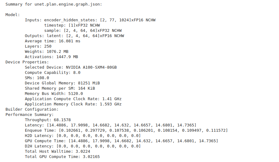
下記のコードでモデル、使用したデバイス、パフォーマンス情報のサマリー情報が取得できます。
print(f"Summary for {plan.name}:\n")
plan.summary()
下記のような出力が確認できます。
Engine Plan データ フレーム
EnginePlan は Pandas DataFrame データ構造をラップしたオブジェクトです。Engine Plan に関する情報をクエリ、スライス、レンダリングするために、このデータ フレーム (df) を利用しています。
データ フレームは、 Engine Plan グラフとプロファイリング JSON ファイルからの情報をキャプチャします。 両方の JSON ファイルが利用可能な場合、各レイヤーのレイテンシ データが 3 つの新しい列として追加されます。
- latency.time (レイヤーのレイテンシを全計測反復で合計したもの)
- latency.avg_time (レイヤーの平均レイテンシ)
- latency.pt_time (エンジン全體のレイテンシに占めるレイヤーの割合)
- total_io_size_bytes
- weights_size
- total_footprint_bytes
データ フレームへのアクセスは簡単で下記のように行うことができます。
df = plan.dfデータ フレームは表としてレンダリングできます。 列は様々なレイヤーのものです。カラム コントロールを使用して、レイヤーをソートまたはフィルタリングできます。
display_df(plan.df)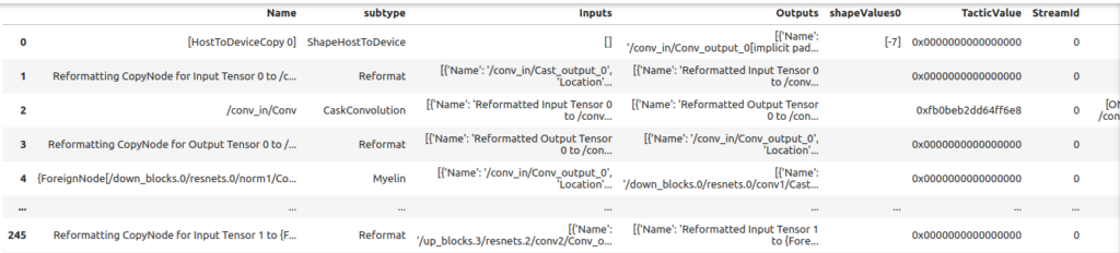
TREx の display_df 関數を使用する場合は下記のような Issue があります。もし display_df 関數が上手く動作しない場合はこちらのドキュメントを參照してください。
エンジン プランのデータ フレームをレンダリングする場合、関數 clean_for_display を使用することで重要な列だけを抽出できます。
- 重要なコラムを前面に出すために、コラムの順番が変更されます。
- カラム Inputs と Outputs は、冗長性を減らすために再フォーマットされます。
- 最後に、 いくつかの列は削除され、NaN はゼロに置き換えられます。
df = clean_for_display(plan.df)
print(f"These are the column names in the plan\n: {df.columns}")
display_df(df)
レイヤーの種類
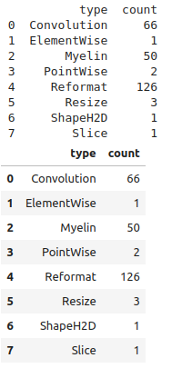
この例では各レイヤータイプのカウントの棒グラフを作成する方法を示します。trex は Pandas の API をラップしたユーティリティを提供するため、Engine Plan データ フレームからデータを抽出することができます。
layer_types = group_count(plan.df, 'type')

# Simple DF print
print(layer_types)

# dtale DF display
display_df(layer_types)
Myelin という一般的でないレイヤーが出ているので補足を入れると、Myelin は Transformer ライクなモデルでよく使われる pointwise operations 融合や Multi Head Attention 融合の機能を TensorRT に提供しています。この Issue で Myelin について觸れられています。
TREx は plotly のプロット API のラッパーを提供します。 plotly_bar2 は棒グラフを作成するためのメイン ユーティリティです。
plotly_bar2(
    df=layer_types,
    title='Layer Count By Type',
    values_col='count',
    names_col='type',
    orientation='v',
    color='type',
    colormap=layer_colormap,
    show_axis_ticks=(True, True))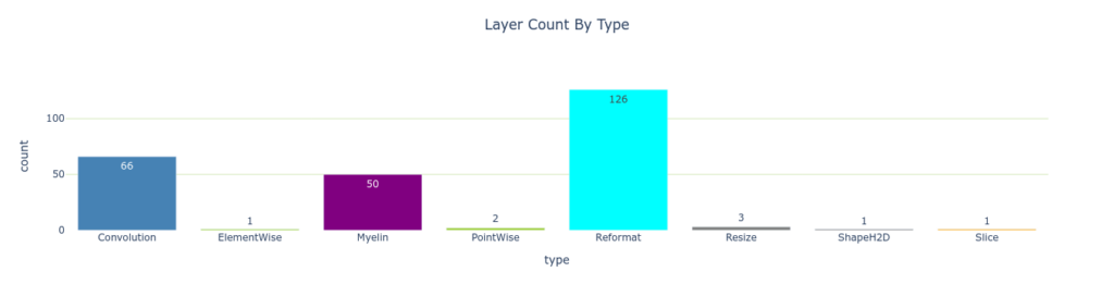
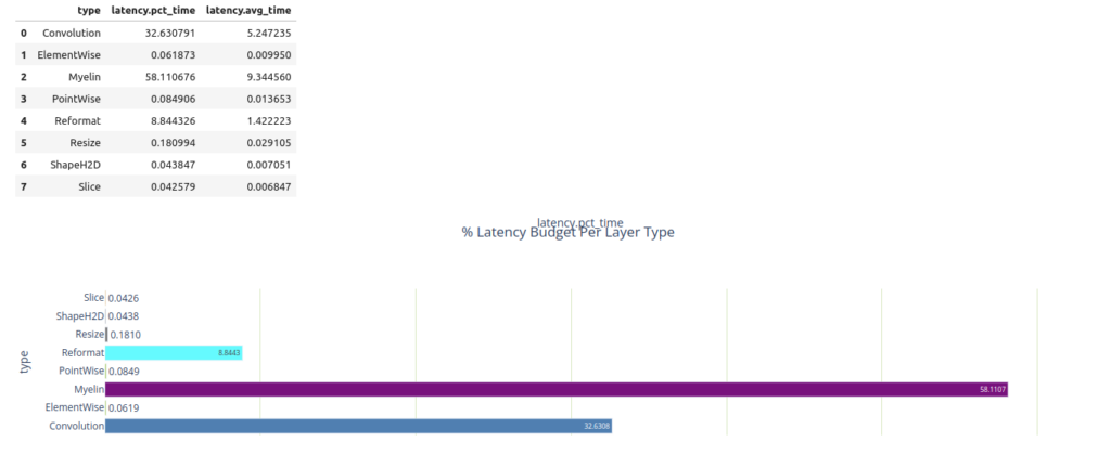
Pandas の API を Engine Plan データ フレームで使用すれば、最も時間を消費する 3 つのレイヤーを簡単にクエリできます。Myelin が最も時間を消費していることが分かります。
top3 = plan.df.nlargest(3, 'latency.pct_time')
display_df(top3)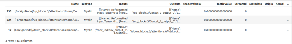
以下のグラフはレイヤーのレイテンシを簡単に示したものです。 values_col の値はバーの高さを設定し、 names_col の値はバーの名前を設定します。この場合、 各レイヤーのレイテンシがレイヤー名に対してプロットされます。バーの色は color と colormap によって決定されます。 バーの色はレイヤーの種類 (type) と layer_colormap によって決まります。
plotly_bar2(
    df=plan.df,
    title="% Latency Budget Per Layer",
    values_col="latency.pct_time",
    names_col="Name",
    color='type',
    use_slider=False,
    colormap=layer_colormap)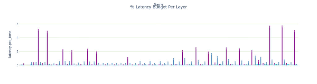
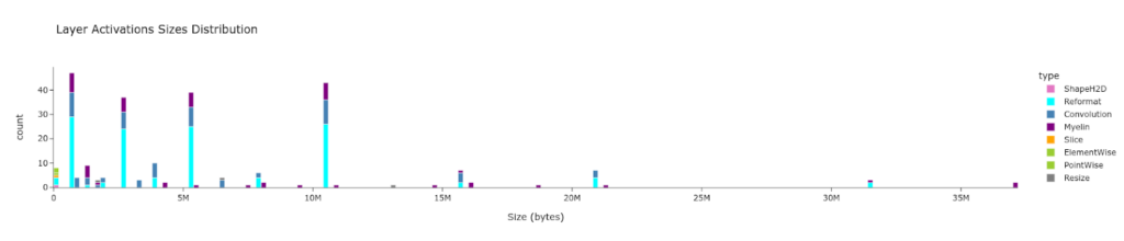
plotly_hist は Plotly のヒストグラムチャートのラッパーです。 plotly_hist は values_col のヒストグラムをプロットします。レイヤーの latency の分布は時間軸が橫軸のため、 時間ごとのレイヤーの分布を確認することができます。
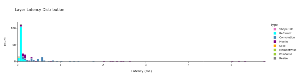
Pandas の機能を用いてレイヤーの latency をレイヤーの種類ごとにグループ分けしています。データはチャートとして以下のようなサマリー テーブルとして表示することができます。
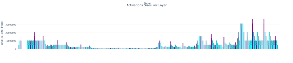
メモリ トラフィック
下記の情報を表示します。
- レイヤーごとの Weight のサイズ
- レイヤーごとの Total IO のサイズ
- サイズごとの各レイヤー數
plotly_bar2(
    plan.df,
    "Weights Sizes Per Layer",
    "weights_size", "Name",
    color='type',
    colormap=layer_colormap)

plotly_bar2(
    plan.df,
    "Activations Sizes Per Layer",
    "total_io_size_bytes",
    "Name",
    color='type',
    colormap=layer_colormap)

plotly_hist(
    plan.df,
    "Layer Activations Sizes Distribution",
    "total_io_size_bytes",
    "Size (bytes)",
    color='type',
    colormap=layer_colormap)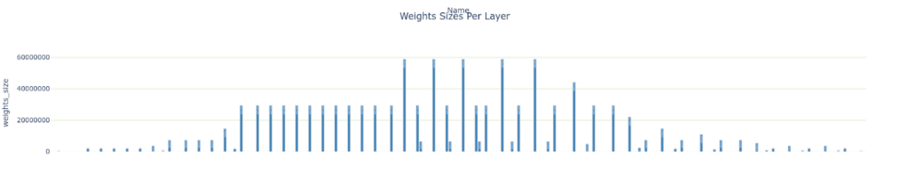
レイヤーの數値精度
trex はPlotly の円グラフのチャートをグリッドにプロットすることができます。precision_colormap は precision の値でスライスを色分けします。
charts = []
layer_precisions = group_count(plan.df, 'precision')
charts.append((layer_precisions, 'Layer Count By Precision', 'count', 'precision'))

layers_time_pct_by_precision = group_sum_attr(plan.df, grouping_attr='precision', reduced_attr='latency.pct_time')
display(layers_time_pct_by_precision)

charts.append((layers_time_pct_by_precision, '% Latency Budget By Precision', 'latency.pct_time', 'precision'))
plotly_pie2("Precision Statistics", charts, colormap=precision_colormap)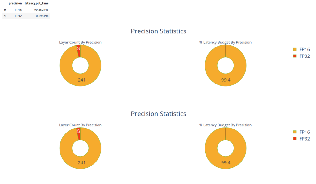
グラフのレンダリング
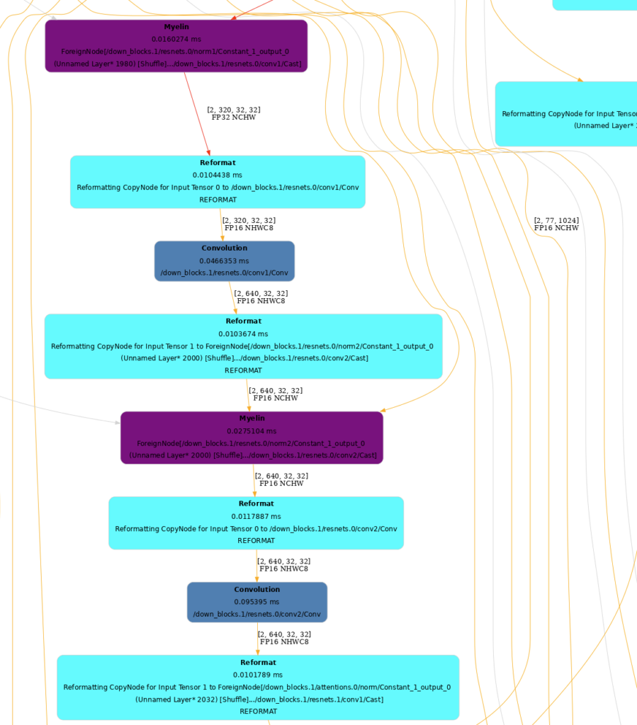
TensorRT の Engine を描畫することは內部構造を把握するのに役立ちます。
フォーマッタを使用してノードの色を設定することができます。TREx にはグラフノードをレイヤの種類に応じて塗り分ける layer_type_formatter と、グラフノードを精度に応じて塗り分ける precision_formatter が用意されています。
to_dot は EnginePlan をドット ファイルに変換し、SVG や PNG にレンダリングします。
SVG ファイルは PNG よりもレンダリングが速く検索可能ですべての解像度でシャープで鮮明なグラフを提供します。 グラフのサイズは大きいので、レンダリングしたグラフ ファイルは別のブラウザー ウィンドウで表示することをお勧めします。
formatter = layer_type_formatter if True else precision_formatter
graph = to_dot(plan, formatter)
svg_name = render_dot(graph, engine_name, 'svg')
グラフが大きいので一部だけ表示します。
特定のレイヤーの解析
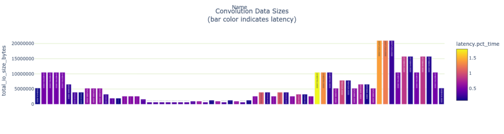
TREx は get_layers_by_type という API を提供しておりレイヤーのタイプに特化した前処理を行うことができます。畳み込みの場合は下記のようになります。畳み込み層に特化してレイヤーごとの latency と使用しているデータ サイズを表示しています。
convs = plan.get_layers_by_type('Convolution')

plotly_bar2(
    convs,
    "Latency Per Layer (%)<BR>(bar color indicates precision)",
    "attr.arithmetic_intensity", "Name",
    color='precision',
    colormap=precision_colormap)

plotly_bar2(
    convs,
    "Convolution Data Sizes<BR>(bar color indicates latency)",
    "total_io_size_bytes",
    "Name",
    color='latency.pct_time')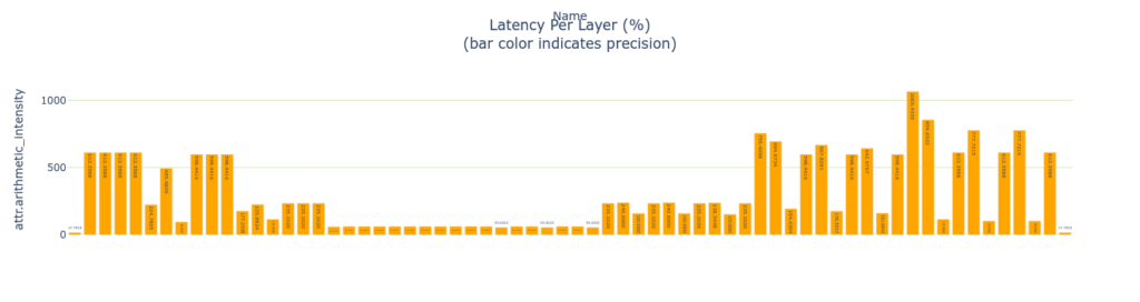
Arithmetic Intensity
畳み込み層は arithmetic intensity を測ることができます。arithmetic intensity はデータ 1 バイトあたりに費やされる演算量の尺度です。データの移動は演算よりもはるかに遅いため一般に arithmetic intensity が高いレイヤーの方が効率的です。GPU はメモリからデータをフェッチするよりもはるかに高速に計算できるためです。これは単純化したモデルでデータを 1 回だけ読み出し、1 回だけ書き出すことを想定しています。実際には、畳み込み演算や GEMM 演算を行う場合、メモリタイルは數回読み込まれ、 通常は高速な共有メモリ、L1 または L2 キャッシュメモリから読み込まれます。
plotly_bar2(
convs,
"Convolution Arithmetic Intensity<BR>(bar color indicates activations size)",
"attr.arithmetic_intensity",
"Name",
color='total_io_size_bytes')
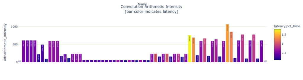
plotly_bar2(
convs,
"Convolution Arithmetic Intensity<BR>(bar color indicates latency)",
"attr.arithmetic_intensity",
"Name",
color='latency.pct_time')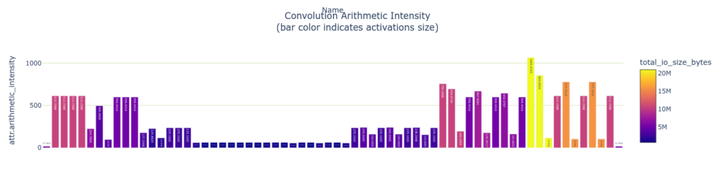
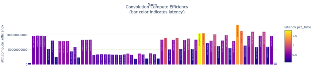
演算効率とメモリ効率を測定します。 これらの指標は演算數 (またはメモリ バイト數) をレイヤーの実行時間で割ることで計算されます。
# Memory accesses per ms (assuming one time read/write penalty)
plotly_bar2(
    convs,
    "Convolution Memory Efficiency<BR>(bar color indicates latency)",
    "attr.memory_efficiency",
    "Name",
    color='latency.pct_time')

# Compute operations per ms (assuming one time read/write penalty)
plotly_bar2(
    convs,
    "Convolution Compute Efficiency<BR>(bar color indicates latency)",
    "attr.compute_efficiency",
    "Name",
    color='latency.pct_time')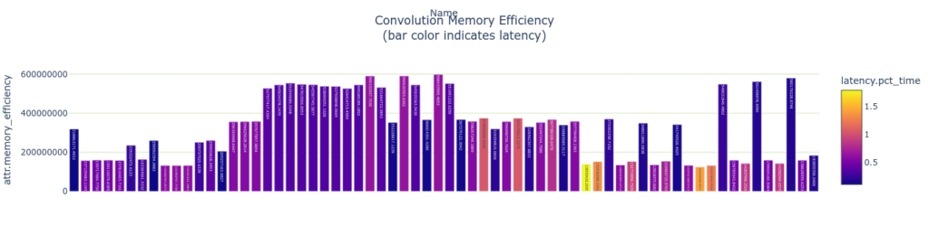
まとめ
本記事では TensorRT 化した Stable Diffusion モデルの解析まで行ってみました。TensorRT Engine Explorer (TREx) によってモデルのボトルネックを判斷し、さらなる速度の改善やメモリ消費の改善に繋げていただけると幸いです。
関連情報
- TensorRT/tools/experimental/trt-engine-explorer at release/8.6 · NVIDIA/TensorRT
- TensorRT SDK | NVIDIA Developer
- TensorRT – Get Started | NVIDIA Developer
- 前編: Stable DiffusionをTensorRT で GPU 推論を數倍高速化