繼續改進我們的 GPU 交叉過濾器儀表板庫 cuxfilter 的用戶體驗和功能。下面簡要介紹一下它的最新功能。
首先,訪問 cuxfilter 與以往一樣簡單。只需運行一個標準的 RAPIDS 安裝,如 入門頁 中所示。此外,您可以在 PaperSpace 在線試用。一個完整的 RAPIDS 安裝的強大優勢之一就是你可以在一個 jupyter 筆記本或實驗室實例中處理你的數據并將其可視化。
以下是一些主要功能亮點的列表:
- 通過數據陰影的高密度散點圖、線圖、熱圖和圖表。此外, Deck . gl 中的 choropeth 地圖,以及 bokeh 中的條形圖和折線圖。
- 一個完全響應的, 可自定義布局 ,帶有小部件側面板。
- Themes ,如前面所示的黑暗面。
- 一個使用
await d.preview()的 預覽功能 ,它生成一個與筆記本內聯的完整儀表板的. png 圖像。 - 使用
d.export()調用在活動儀表板中執行 導出所選數據 的功能。 - 能夠作為一個獨立的應用程序(在筆記本之外)進行部署,如我們的 部署多用戶儀表板 文檔所述。
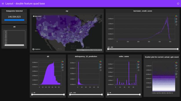
您可以在我們的 教程筆記本, 中嘗試所有這些和更多功能,并在我們的 教程視頻 中繼續使用。圖 2 所示的屏幕截圖是創建的儀表板之一。這是一個引人注目的例子,演示了如何將 RAPIDS 庫組合在一起,只需幾行 python 就可以快速創建強大的可交叉過濾的儀表盤。
?
This file contains bidirectional Unicode text that may be interpreted or compiled differently than what appears below. To review, open the file in an editor that reveals hidden Unicode characters.
Learn more about bidirectional Unicode characters
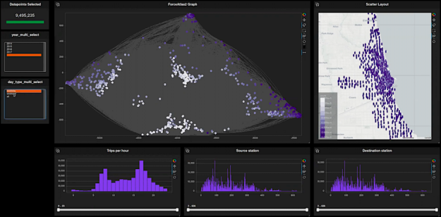
| # Dashboard | |
| # Full example from https://github.com/rapidsai-community/showcase/tree/main/team_contributions/cuxfilter-tutorial | |
| # Data | |
| cux_df = cuxfilter.DataFrame.load_graph((final_df, edges)) | |
| # Charts | |
| chart1 = cuxfilter.charts.graph( | |
| edge_source='src', edge_target='dst', | |
| edge_color_palette=['gray', 'black'], | |
| ode_pixel_shade_type='linear', | |
| edge_render_type='curved', #curved, direct | |
| edge_transparency=0.6, #0.1 - 0.9 | |
| title='ForceAtlas2 Graph' | |
| ) | |
| chart2 = cuxfilter.charts.scatter( | |
| x='x_original', y='y_original', | |
| tile_provider='CARTODBPOSITRON', | |
| point_size=4, | |
| pixel_shade_type='linear', | |
| pixel_spread='spread', | |
| title='Scatter Layout' | |
| ) | |
| chart3 = cuxfilter.charts.bar('hour', title='Trips per hour') | |
| chart4 = cuxfilter.charts.bar('from_station_id', title='Source station') | |
| chart5 = cuxfilter.charts.bar('to_station_id', title='Destination station') | |
| # Widgets | |
| widget1 = cuxfilter.charts.multi_select('year') | |
| widget2 = cuxfilter.charts.multi_select('day_type', label_map={0:'weekday', 1:'weekend', '':'all'}) | |
| # Layout Grid | |
| layout_array_3rds = [[1,1,2],[1,1,2],[3,4,5]] | |
| # Generate Dashboard | |
| d = cux_df.dashboard([chart1, chart2, chart3, chart4, chart5], | |
| sidebar=[widget1, widget2], | |
| layout_array = layout_array_3rds, | |
| theme=cuxfilter.themes.rapids, | |
| title="Network and Geospatial Graph") | |
| # Show | |
| d.show() |
 by
by 今后,我們將繼續改進 cuxfilter ,并使用它與龐大的 pythonviz 社區協作,例如 書 、 Holoviews 、 面板 和 數據陰影 項目。我們鼓勵您嘗試一下,并且一如既往,如果您對功能請求有任何問題, 讓我們知道我們的 GitHub 。快樂的交叉過濾!